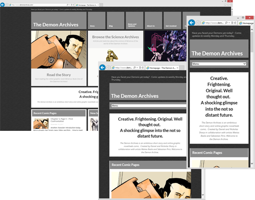
Good afternoon Readers!
I’m hoping that you are all doing well and are gearing up for some serious holiday action. So today I wanted briefly to talk about the website design, and how we have done our best so that most of you will never really notice the cool things that we did. There is this saying when it comes to design, and it is more or less along the lines of “if the design is good, it will facilitate the consumption of the material, but it will mostly go unnoticed by the majority of users”.
One of the fun things we did with this website was to choose a responsive theme. This has to do with the way our theme behaves on different sizes of computers, tablets, and phones. I bet most of you didn’t even notice, but resize your browser window right now and watch how the site reacts… go on… I’ll wait. Did you see that magic? Pull out your phone and browse to the site… come on, just do it… Bam… different display and nav menu.
If you want to see more or less what I am talking about, just go to http://responsive.is/demonarchives.com and play around with the different devices on top. And there you have it ladies and gentleman, a really cool design technique that resizes both images and text, and flows the layout so that each reader is presented with a readable and enjoyable website.
We hope you are all well, and that you will be able to pass some quality time over the holidays with your loved ones. For those of you who can’t, stay tuned and maybe I’ll be able to get Seba and Matias to do some fun holiday themed sketches that will lighten your heart.
Take care, and stay tuned for the final entry in the powered armor science articles due out tomorrow.